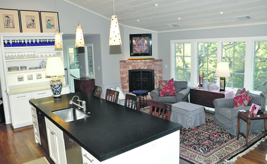
 | | | Great food. Great conversation. Great view. Unbeatable combination. The Warners' kitchen is truly the heart of their home. Photos Andy Scheck
| | | | | | A mid-century ranch style residence that had lost its heart seems like an unlikely choice to receive one of Orinda's 2011 Mayor's Awards for Excellence in Architecture. Unlikely, that is, until you learn about the collaboration of love between the home's owners, an architect from an award-winning firm known for its soulful restoration designs, and the Orinda-based contractor who made their dreams real.
 The residence, on Via Hermosa, received an award in the category for minor residential additions under 1,500 square feet and remodels. Like other winners this year, the Via Hermosa remodel was recognized for outstanding "property improvements which make an extraordinary contribution to the character and livability of Orinda neighborhoods."
 Originally built as a minimalist home with a detached garage, the main mid century ranch style structure sprouted from a hill above the Orinda Country Club more than half a century ago, and was most likely created as a getaway cottage, according to present owners Susan and Howard Warner.
 When she first viewed it roughly 14 years ago, says Warner, the property had "almost a magical feel." She is still clearly mesmerized. "I loved the house from the very beginning."
 Woven into the house's historical tapestry are tales of fitness legend Jack LaLanne's time here. The LaLanne family is credited with at least one of the residence's numerous remodels - the enclosure of the walkway between the main house and detached garage which created a new living room area.
 Since that time, the house has "undergone a number of discordant remodels and additions," according to Jarvis Architects, a recipient of previous Orinda awards for architecture and the firm chosen by the Warners in 2009 to modernize their residence while still retaining its old Orinda charm.
 Robin Pennell, the lead architect on the Warner's project, has been a partner with Jarvis since 1991. "He was very keyed in to what we wanted," says Warner. "He really kept the integrity of the house."
 That house, says Pennell, "had probably six distinct additions, each done a little more poorly than the last. There was nothing that held the house together." Warner points to the different styles of flooring employed in each room as major contributors to the home's "hodgepodge" feeling prior to its re-design.
 Both echo the other's sentiment- "The house had no heart."
 Saying that "none of the rooms were in the right place" and describing the residence as having "a lot of rambling spaces," Pennell said his job was to simplify the house and pull it together by removing much of the offending work that had been done over the years.
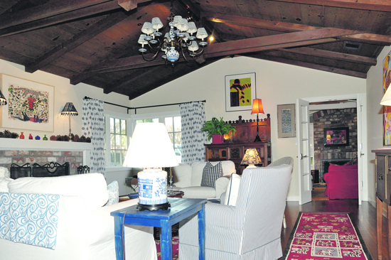
 Both Pennell and Warner note that there were features with fascinating and important character that were worth preserving - flush doors with distinctive grooves that evoked an almost art deco feel, beamed ceilings, and a living room that was unusually large for this period of ranch home design. That room, says Warner, was and still is "the true essence of the original home."
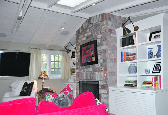
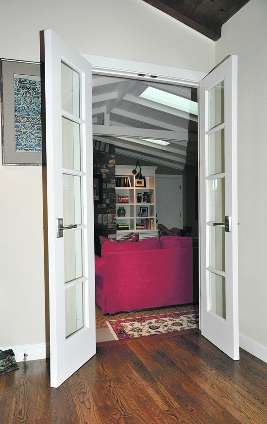
 A sense of history resonates from the living room's original old brick fireplace, which has been transformed into a focal point for visitors by flanking white bookshelves and comfortable, inviting furniture.
 Warner and Pennell decided to replicate the grooving on the majority of the home's doors, as well as other pewter and wood touches to create a more consistent feel from room to room. Two additional fireplaces were re-bricked to match the one in the living room, and wood floors are now visible throughout the home - except in the bathroom where marble was installed. A new powder room was also created to ensure the comfort of visitors.
 "I really wanted this design to stand the test of time," says Warner.
 The living room ended up serving as an anchor for the remodel so that the contractor, Kirk Wall, could dramatically transform the kitchen, dining, and family room areas per Pennell's vision. Wall, says Pennell, "helped make design decisions along the way. He has a nice eye. This would not be what it is if any one of the three [collaborators] was not participating."
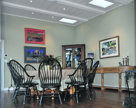
 The whole back of the house now has a view of Mount Diablo - a simply stunning sight that is felt as much as seen upon entering the front door, thanks to the redesign.
 "The flow is wonderful," says Warner. "It feels very spacious - much more than the original design."
 Strategically placed French doors between the family and living rooms also contribute to that sense of openness, as does the high ceiling in the kitchen, Warner's favorite room in the house. Warmed by a fireplace on chilly, okay-to-burn days, it truly is the heart of the home - a comfortable place where visitors are inspired to put their feet up, relax, and zone out to the serenity of the natural views. It is the perfect setting for Warner who enjoys having family and guests near her while cooking.
 Gnarled oak trees visible from the dining room give one a sense of timelessness. At least one of these sturdy friends is believed to be 150-years-old.
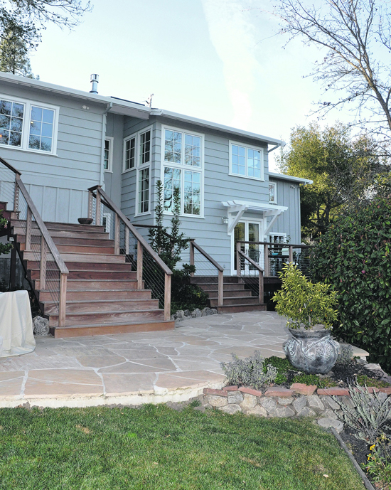
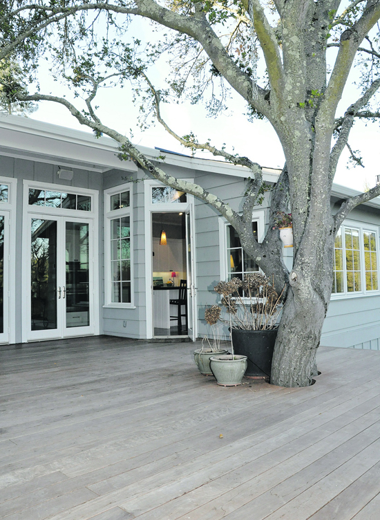
 It's also easy to have fun. The kitchen and dining room areas open onto an expansive deck. During the summertime, Warner rolls out indoor-outdoor carpeting to create a single large entertainment-living space accommodating up to five tables for guests. An outdoor barbecue supports work done inside in the kitchen.
 Pennell added large wide steps to the deck to encourage the Warners' guests to come down and enjoy the backyard, newly re-landscaped with native plants to help conserve Orinda's precious water. He also strengthened indoor efficiencies, improving the heating and water systems and insulation.
 "Look at every path closely and deliberately," wrote Carlos Castaneda. "Does this path have a heart? If it does, then the path is good."
 ARCHITECT:
 Robin Pennell
 Jarvis Architects
 5278 College Avenue
 Oakland, CA 94618
 Telephone: (510) 654-6755
 info@jarvisarchitects.com

|

