 |
|
|
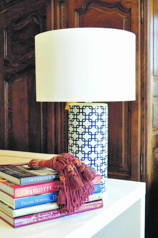
Here we used two contemporary pieces in a traditional living room: a graphic blue lamp, white lacquer table and mixed stacks of design books, but added the tassel in red with the same undertones as the antique cabinet in the back. We also looked for books to stack that had varying tones of red and blue in their bindings. Photos courtesy Couture Chateau llc, photos Faryn Davis Photography
|
|
|
|
|
|
Red, white and blue are quintessential summer colors. Let's be honest, your first thought about decorating the living room doesn't automatically go to the American Flag. When you start to train your eye and see color combinations, however, you will be shocked at how often this classic color combination pops up. These colors are actually incredibly easy to work with. Red, white and blue can be placed into almost any color story.
 The good news: I will teach you a few tricks so you can think outside the box with my Top Stylish Solutions for red, white and blue decorating.
 1) Get to know your undertones. An undertone is the foundation of the color or reduced color. You can mix any color with another, as long as the undertone is the same. This is one of those color theory truths many homeowners don't understand. It is single handedly responsible for sending us to the funny farm when trying to choose a basic white.
 The easiest way to find the undertone is to look at the paint sample with variations of color from light to dark. Is it pink at the bottom and deep red at the top? The undertone is pink. Find a similar color of red where the light color at the bottom is yellow? The undertone is yellow. If you are mixing red with blue, you can match any tone as long as the undertones are the same. Look for a blue and red that stem from the same undertone and they will work together.
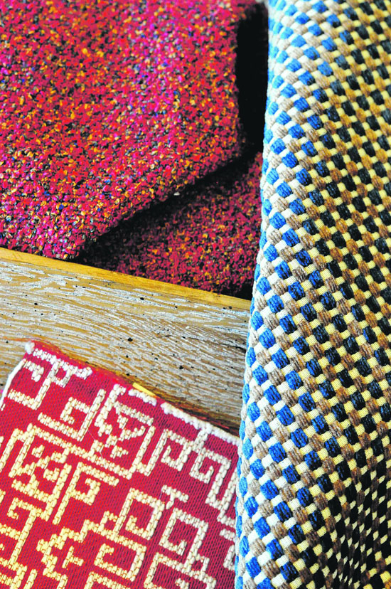
 In a current Moraga family room project, we brought in deep cranberry reds in the boucle (for a large custom ottoman), a woven blue and white square pattern (side chair) and then a graphic bright red and white pattern with the same undertones (custom bench). What could have been loud and overdone became accessible and easy to live with simply by using and understanding tone.
 The floors are a gorgeous deep brown hardwood and the custom chesterfields a rich felt grey menswear fabric from Scotland - all with the same undertones.
 2) Look for something close by that is red, white or blue as a starting point. Trust me, when we were first contacted about an historic exterior on a major corner in Berkeley my heart skipped a beat. The building was outdated and needed major restoration. The old colors were all off. The owners wanted something fresh and I had one chance to get the color right. A wrong tone, especially when my first thought went to red in Berkeley, and we'd have the Cal Marching Band saying "Take off that red paint!" This Cal alum decorator didn't want to get the proverbial axe.
 What did I do? I started with the blue from the nearby street signs and the red from the brick at the back of the building. I used that as a jumping off point for our main color selections, diminished the colors to common undertones in both red and blue, and applied the triad rule from the color wheel. The shades then fell into place. There was a great deal of testing and we actually have four shades of red as an accent, but it was so fun. Sometimes you have to go bold.
 The next time you are considering an update, look around. What in your home is red, white or blue. Is it a stack of books? Is it a simple accessory from Home Goods? Then use them and group them!
 Get intentional about those details and your space will perk up immediately. 3) Understand that mixing textures and types is what takes it to the next level. Mix it up to look more expensive. This season we had an abundance of red, white and blue projects. From rental properties in Tahoe to traditional in Moraga, many clients were drawn to this combination.
 To keep red, white and blue projects from being too "room in a box," we mix textures and types. Get comfortable mixing simple cotton prints with heavier crewel fabrics or buying one yard of an over the top fabric and upholstering a simple vintage foot stool with it, then bringing it down a level by using woven or natural fibers such as with a tray, or use a blue grass cloth.
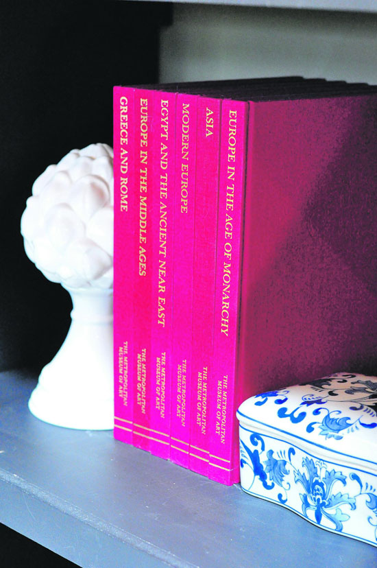
 I like using stacks of books, which you can purchase second hand, single tassels and white ceramic accessories to fill out statement rooms with red and blue. Easily changed, these are good places to start. Mistakes aren't costly and you can practice with scale.
 Whatever you choose, make a statement, do it with style, and live a custom life!

|
| Ann McDonald, IIDA, NAPO, is the Founder/CEO of Couture Chateau, a luxury interior design firm in Orinda. If you are interested in chatting about your next decorating project, give us a call at (925) 386-0720 - we're here all summer. For more photos of red, white and blue projects, visit www.couturechateau.com/blog. |

