| | Published November 14th, 2018
| New lighting, color and upholstery design trends unveiled
| | | By Amanda Eck |  | | Photo provided |
I love to keep up with what's trending in color and see what's new for lighting and upholstery, so I recently returned once again from North Carolina following the fall furnishings market at High Point. The High Point Market is the largest furnishings industry trade show in the world, bringing more than 75,000 people to High Point, North Carolina, every six months. With more than 2,000 exhibitors and 11.5 million square feet of showrooms, it is the Disney World for interior designers. It's a great way for me to see new products that will be introduced to the marketplace the following season. High Point also offers me the ability to touch, feel and sit on pieces that I am considering for client projects.
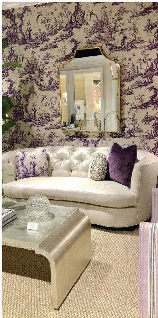
 As with every market, there is always a buzz around color. And the fall market did not disappoint; there was lots of color. Navy is still going strong and was seen paired with burgundy, orange, green or blush. Speaking of blush, this soft hued pink was still everywhere, from upholstery to artwork to wallpaper. I have even noticed big chain retailers like Target and Pottery Barn are embracing the blush trend. Green as with blue is, of course in my book, always "in", especially the warmer more muted tones of green, from olive to sage. Red is also making its way back into the hearts of the furnishing industry. I saw lots of red paired with soft shades of blue. One color, that I personally am not a huge fan of, that seemed to be trending was purple! It was more of a soft lavender or light lilac. It was seen paired with creams, taupes, and even mint green. Needless to say, color is making a comeback - and it's bold and bright.
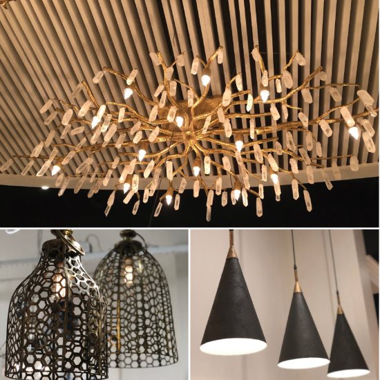
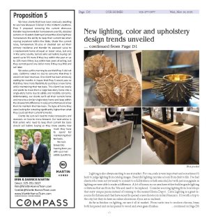
 Lighting is also always exciting to see at market. For one, scale is very important and sometimes it's hard to judge lighting from catalog images. Beautiful lighting can take a room from drab to fab. I've had clients who were not yet ready to commit to a full kitchen or bath remodel, but with just an upgrade in lighting we were able to make a difference. A lot of homes in our area have either builder grade lighting or fixtures that are from the '80s and need to be replaced. Consider sourcing lighting from local shops that carry unique pieces instead of running to the nearest Home Depot. Circa Lighting is a great resource for fixtures and they have recently opened a new showroom in San Francisco. It's worth a trip to the city, but they do have an online showroom if you are so inclined.
 As far as finishes on lighting, we saw it all at market. From rustic iron to modern chrome, brass both lacquered and un-lacquered to wood and even gesso finishes.
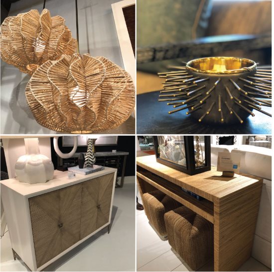
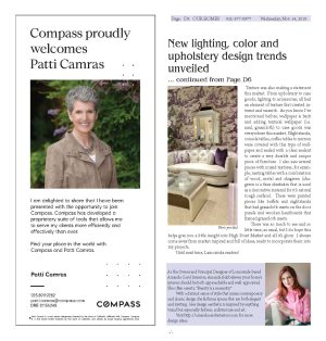
 Texture was also making a statement this market. From upholstery to case goods, lighting to accessories, all had an element of texture that created interest and warmth. As you know I've mentioned before, wallpaper is back and adding textural wallpaper (i.e. sisal, grasscloth) to case goods was everywhere this market. Nightstands, console tables, coffee tables to mirrors were covered with this type of wallpaper and sealed with a clear sealant to create a very durable and unique piece of furniture. I also saw several pieces with mixed textures, for example, nesting tables with a combination of wood, metal and shagreen (shagreen is a faux sharkskin that is used as a decorative material for it's natural rough surface). There were painted pieces like buffets and nightstands that had grasscloth insets on the door panels and wooden headboards that framed grasscloth insets.
 There was so much to see and so little time, as usual, but I do hope this helps give you a little insight into High Point Market and all it's glory. I always come away from market inspired and full of ideas, ready to incorporate them into my projects.
 Until next time, Lamorinda readers!

|
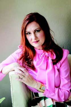
 | | Photo provided |  | | Photo provided |  | | As the Owner and Principal Designer of Lamorinda-based Amanda Carol Interiors, Amanda Eck believes your home's interior should be both approachable and well- appointed. She often asserts, "Beauty is a necessity." With a distinct sense of style that mixes contemporary and classic design she fashions spaces that are both elegant and inviting. Her design aesthetic is inspired by anything visual but especially fashion, architecture and art. Visit http://amandacarolinteriors.com for more design ideas. | | | | | | | |


